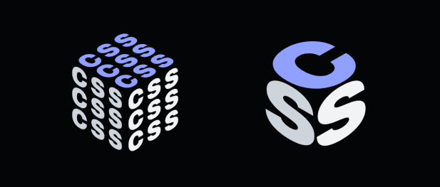
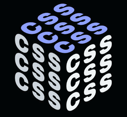
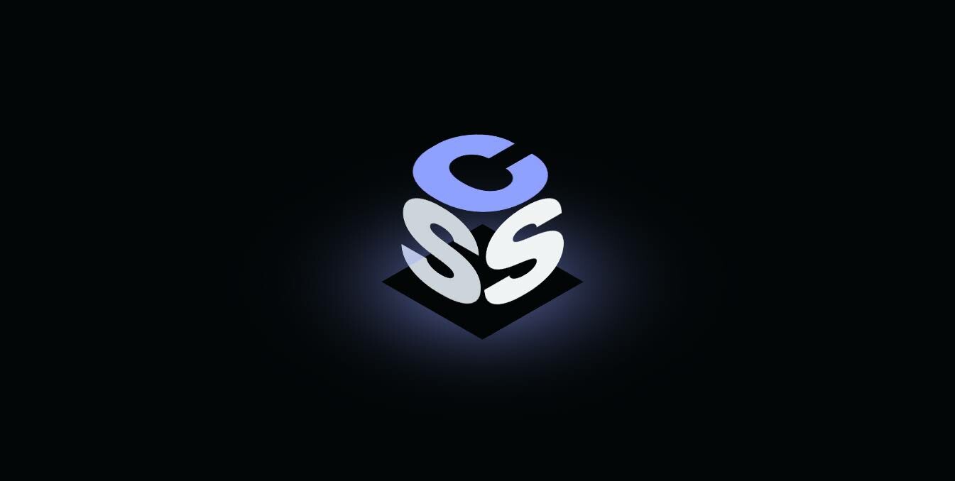
A not so serious pair of logos about CSS. Randomly created, but the final "thing" is definitely working in some ways. I think?
Fun attributes:
- playful use of boxes
- uses the system font (def looks different on my machine 😉)
- light / dark theme adaptive
- resize adaptive
- position in CSS 3D perspective
- no position absolute
Regrts:
- not loading a font?
- trying harder to use
skew() - no accessibility testing
- not using container queries somehow
- sticking to system colors
Dramatic glowy #
Neat-ish. Take away the glow and it still stands.
Cube marquee #
Where did these come from? #
I saw a brand do something similar with different letters, and I imagined CSS could do something really similar, but its way. CSS is about making boxes, a CSS logo could make a box.
Then I wanted it to be adaptive to color, resize, more… and well its been fun, but I kinda wanna pass the torch. See what some forks can do? :wink wink:
STEAL THIS! Use this wherever you want; no restrictions.
There's some neat opportunities for 3D rotating on the transform of .cube; accelerometer or mouse position much?
Does CSS need a new big 4 instead? 😉


