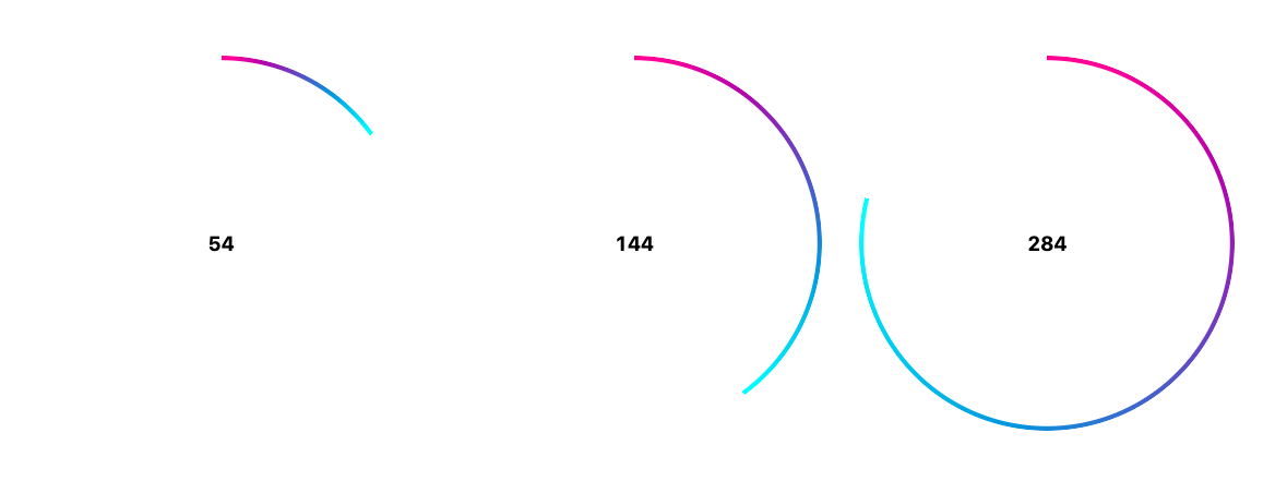
CSS masks and gradients are so rad, there's so much you can do with them.
This trick uses two gradients;
- a radial gradient mask, hiding the inner part of the conic
- a conic gradient, visible up to the angle, then transparent
Let's see some code #
Start with making a square, so it's easy to make a circle.
#pie {
  aspect-ratio: 1;
  inline-size: 50vmin;
  border-radius: 50%;
}
Now add the mask and conic gradient. Comments are inline as to why or what each part is doing.
#pie {
  --ng: 120deg; /* can be set via slider */
  --thickness: 3px;

  --_inner: calc(70% - var(--thickness));
  --_outer: calc(var(--_inner) + 1px); /* fixes aliasing */

  /* hides the inner part of the conic gradient/element */
  mask: radial-gradient(circle, #0000 var(--_inner), #000 var(--_outer));

  /* gradient up to --ng, transparent after --ng */
  background-image: conic-gradient(deeppink, cyan var(--ng), #0000 0);
}
The conic gives us the smooth gradient and the angle, while the mask and overall element shape, isolate a thin line of visibility into the conic gradient, completing the illusion.
Try it #
The Codepen hooks up a slider to the angle and some text, to help debug and control the effect.

