RSS FeedTwitterMastodonBlueskyShare IconHeart IconGithub IconArrow IconClock IconGUI Challenges IconHome IconNote IconBlog IconCSS IconJS IconHTML IconShows IconGit IconSpeaking IconTools IconShuffle IconNext IconPrevious IconCalendar IconCalendar Edit Icon
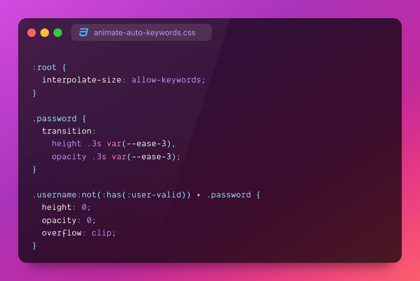
:root { interpolate-size: allow-keywords; }
.password { transition:  height .3s var(--ease-3), opacity .3s var(--ease-3); }
.username:not(:has(:user-valid)) + .password { height: 0; opacity: 0; overflow: clip; }
My google avatar.2 min read

CSS interpolate-size to the rescue

css

Over on Chrome for Developers, @bramus wrote a great piece on interpolate-size and the new transitions it can enable with keywords like auto.

I see the following pattern used when the designer wants to reduce visual noise during sign in, the password field is hidden until a valid username is provided.

The new interpolate-size feature makes this trivial, especially when combined with :has().

caniuse

The Setup #

Opt your whole site into transitioning keywords. This is definitely something that will quickly make it into CSS resets.

:root {
  interpolate-size: allow-keywords;
}

Next, enable transitions on the password field:

.password {
  transition: 
    height .3s var(--ease-3),
    opacity .3s var(--ease-3);
}

Last, hide the password field when the username isn't valid:

.username:not(:has(:user-valid)) + .password {
  height: 0;
  opacity: 0;
  overflow: clip;
}

As soon as the username field is valid, height: 0 will stop applying and the password field will transition to its natural height: auto.

🤩

The Demo #

Here it is all put together.

There's tons of demo's this unlocks, what are you building!?
Mentions #

Join the conversation on

98 likes
20 reposts
  • カルロス
  • Jan ⚓️
  • Marc Friederich
  • Bramus
  • Roni Laukkarinen
  • Jeroen Zwartepoorte
  • OK Lab Flensburg
  • GENKI
  • Tony Ward
  • Seth Rubenstein
  • Luke
  • Kai Eichinger
  • Masta
  • Abel Cabans
  • Freddy
  • Jan Nicklas
  • Traek Wells
  • Freyj
  • D7460N

@argyleink

On iPad, initial load, typing in the username box does not show the password box until you change focus. But once you’ve done that once, going back to the username box and erasing it requires just one character to make the password field appear as in your demo video.

Also, (minor nit) I had to read this a couple of times alongside the adjacent rule:

/* reveal password when username is valid */

I understand the rule to mean “hide password while username is not valid”.

Morgan DavisMorgan Davis

@mdavis that delay on the input validity is `:user-valid`, it's lazy to evaluate. could use `:valid` which is eager, and wouldn't have that delay.

and yeah, hide the password while username is not valid ????????

Adam ArgyleAdam Argyle

@argyleink @bramus or you could just show both fields at the beginning and not move things around while they are being interacted with

Brad DoughertyBrad Dougherty

@brad @bramus indeed! lots of room to make the UX fit your app or preference

Adam ArgyleAdam Argyle

Crawl the CSS Webring