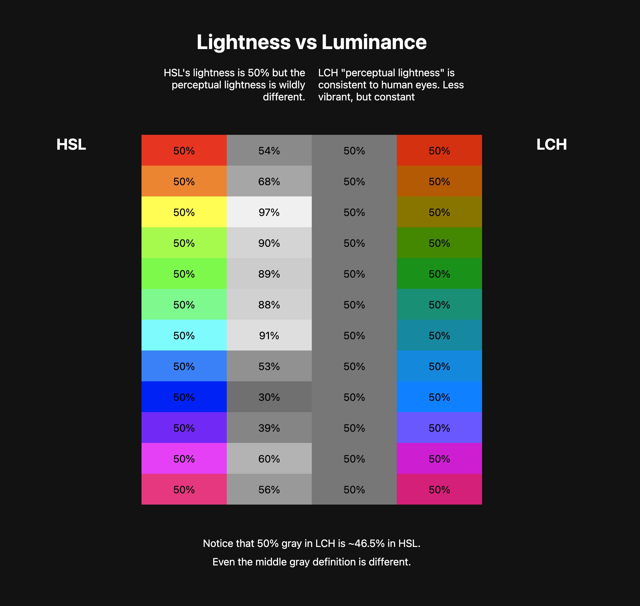
50% lightness in HSL is almost never 50% as humans see it; it's just 50% lightness in that color space.

50% lightness in LCH is built around human lightness perception.
Try in Canary or Safari TP with color web experiments on
This demo shows how wild HSL is.. 50% light yellow is perceptually 97% lightness!! That's a massive difference. And it will totally bite you when you go to measure color contrast
It may look like LCH is muted, desaturated, etc. But remember, we asked for 50% lightness.. so they shouldn't be that exciting, it's a middle of the road color.
This thread and demo showcases why LCH type color spaces should be your colorspace for manipulation.

