Presenting Open Props UI! Imagine
ShadCN and Open Props had
a baby. It's just turned hit
v1 with 25+ components
ready to copy and paste.
Open Props UI, the UI of the future (or now, with feature flags). Components
you can copy or paste into your
projects.Open Props UI
Homepage

the strategy #
A getting started overview also helps paint the delivery strategy of the work:
- Have Open Props and Open Props UI base styles
- Shop the components
- Snag HTML and CSS into your project
The components are shown on the page like interactive docs, sharing the capabilities, markup and styles to reproduce them. Open Props are the way all of these components look like their from the same family.
Pretty sweet giveaway from Felix Bohlin ❤️. Thanks for all this work!
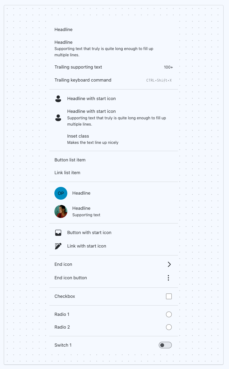
I think my favorite components page is The List 🤘🏻
the tactics #
In practice, after setup, this workflow is sweet.
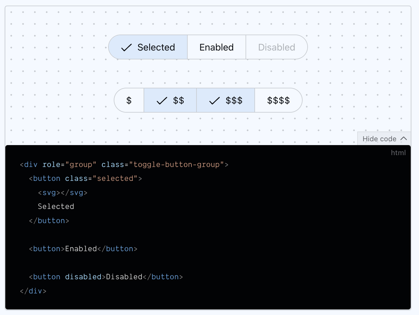
Grab a button; here's one from the docs:
<button class="button">Default</button>
Grab the styles; check the installation section:
@layer components.base {
  :where(.button) {
    --_bg-color: transparent;
    --_border-color: transparent;
    --_border-radius: var(--button-border-radius);
    --_font-size: initial;
    --_min-height: 2.375rem;
    --_text-color: var(--primary);

    -webkit-tap-highlight-color: transparent;
    -webkit-touch-callout: none;
    align-items: center;
    …
  }
}
It slots into your workflow, you don't need to slot into its.
The readme in the repo has a great closing summary of the intent of this library:
Everything is made with ease-of-use and scalability in mind. Last but not
least - you copy and paste the components into your repo. It's the best way to
have a complete understanding and ownership over your stuff.
the goal #
From the repo: The point is to let the spec and the components mature alongside each other and in time the library will be ready for production.
- Have sensible defaults without sacrificing flexibility and control
- Use modern HTML & CSS features
- Follow accessibility guidelines
- Serve as an inspiration
- Be scalable

