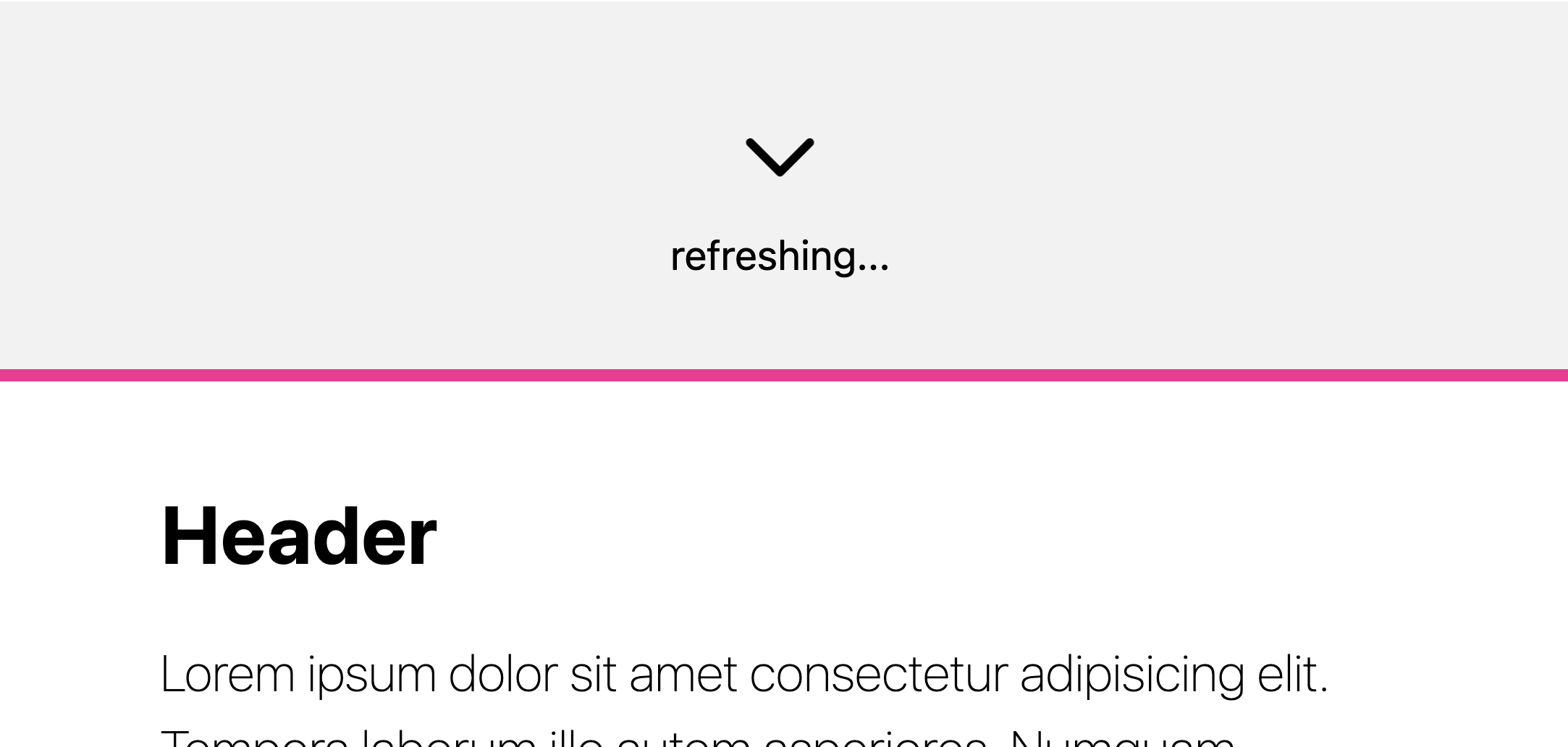
Here's a classic UI feature, pull-to-refresh:
Lemme swiftly break down the effect and how I made this prototype.
Overview #
The markup is a <header> and a <main> element, where the header is the PTR (pull-to-refresh) visual indicator and the main element is the primary document to be refreshed:
<header id="refresh">
  <svg>…</svg>
  <span>Pull to refresh</span>
</header>
<main id="refresh-main">
  <h1>…</h1>
  <p>…</p>
</main>
Then, setup the snap scroller on :root and give it smoooth scroll behavior so that programmatic scroll position assignment (like when the refresh task is complete and main is scrolled to) interpolates:
html {
  scroll-snap-type: y mandatory;
  overscroll-behavior: contain;
  scroll-behavior: smooth;
}
Hacky scroll-start #
Next give the main element a snap align position, and since it's the only child of the scroller that has an assignment AND since the scroller has snap-type set to mandatory, the main element will be snapped when the page is first rendered:
main {
  /*  the only child with snap alignment is "scroll start"  */
  scroll-snap-align: start;

  /*  it's not "toss to refresh"  */
  scroll-snap-stop: always;
}
So that's a bit tricky, because the PTR element also needs to be a scroll snap point so it's snaps when we scroll up… This is where this first tricky trick comes in; where we're going to give the PTR element a snap-align position, but after a delay. The delay is to trick the browser into rendering the main element as a pseudo scroll-start element, and then right after, to give the PTR element a snap position so a user can snap to it.
The 2nd part of this trick is the snapping element is a pseudo element that's much smaller than the PTR element (10px tall), and this makes the snap point require a very deliberate user gesture, like the user needs to scroll the refresh element quite far into view before it takes snapping away from <main>:
#refresh::before {
  content: "";
  position: absolute;
  inset: 0;
  block-size: 10px;
  animation: delayed-snap-point 2ms forwards;
}

@keyframes delayed-snap-point {
  to { scroll-snap-align: start }
}
So this says, after 2ms, assign the refresh 10px tall pseudo element a snap alignment of start.
Scroll Driven Animation #
So far we've setup our HTML, got the page to render with the main element as the starting scroll position, and then made a 10px tall snap element for the PTR target. Next, we get to animate the elements inside the PTR container to rotate and fade in as they enter the viewport.
If you're new to SDA, you gotta check out Bramus's website scroll-driven-animations.style. It's absolute fuckin gold.
First, let's make the keyframes, since at least for me, I first think about the animation I want and I can articulate in the keyframes pretty quickly. The first one is pretty unexciting, a classic fade in. This will be used for the text prompt in the PTR element:
@keyframes rotate-in {
    to {
        transform: rotateZ(.5turn);
    }
}

@keyframes fade-out {
    to {
        opacity: 0;
    }
}
These keyframes will apply as the element is leaving the viewport (the top), which interestingly feels like it's entering the viewport because we're scrolling it in from the top with a user gesture.
This can be difficult to imagine in your mind, and Bramus has got your back again! He's made a tool to see the phases and their viewport intersections. Here I've recorded me using it to show the phase these keyframes will run for:
This should help you see how the exit phase maps so closely to the pull-to-refresh scroll linked effect we're going for!
Next we can use the keyframes and tie them to a view-timeline for each element we want to animate:
#refresh > svg {
  animation: linear rotate-in;
  animation-timeline: view();
  animation-range: exit 0% exit 100%;
}

#refresh > span {
  animation: linear fade-out;
  animation-timeline: view();
  animation-range: exit -200% exit 100%;
}
The elements use their own viewport presence view() as the animation range. The range phase is specified as exit and each instance tailors that range a little bit since their own presence is so small (their own size).
Some JS to complete the UX #
The scrollend event is clutch here for us to know when the user's scroll gesture has completed. Then we can check scrollTop to see if scroll ended at the top, at which point we can trigger some data fetching, or in this case, simulate it.
import {scrollend} from 'https://cdn.jsdelivr.net/gh/argyleink/scrollyfills@latest/dist/scrollyfills.modern.js'

const ptr_scrollport = document.querySelector('html')
const ptr = document.querySelector('#refresh')
const main = document.querySelector('#refresh-main')

const determinePTR = event => {
  if (event.target.scrollTop <= 0) {
    // fetch()
    ptr.querySelector('span').textContent = 'refreshing...'
    ptr.setAttribute('loading-state', 'loading')

    // sim response
    setTimeout(() => {
      ptr.querySelector('span').textContent = 'done!'

      setTimeout(() => {
        ptr.removeAttribute('loading-state')
        main.scrollIntoView({ behavior: 'smooth' })

        // wait half a second so the user can see the done! message
        window.addEventListener('scrollend', e => {
          ptr.querySelector('span').textContent = 'Pull to refresh'
        }, {once: true})
      }, 500)
    }, 2000)
  }
}

window.addEventListener('scrollend', e => {
  determinePTR({target: ptr_scrollport})
})
At the end of all this logic, it scrolls <main> back into view with scrollIntoView() and then the user can trigger it all over again if they like!
Try it #
Here's the Codepen, give it a shot. It's best in Chrome Canary until SDA has better support.
Worth double noting this is a prototype and isn't production ready, but does give you many tools to help round out interactions that are linked to scroll.

